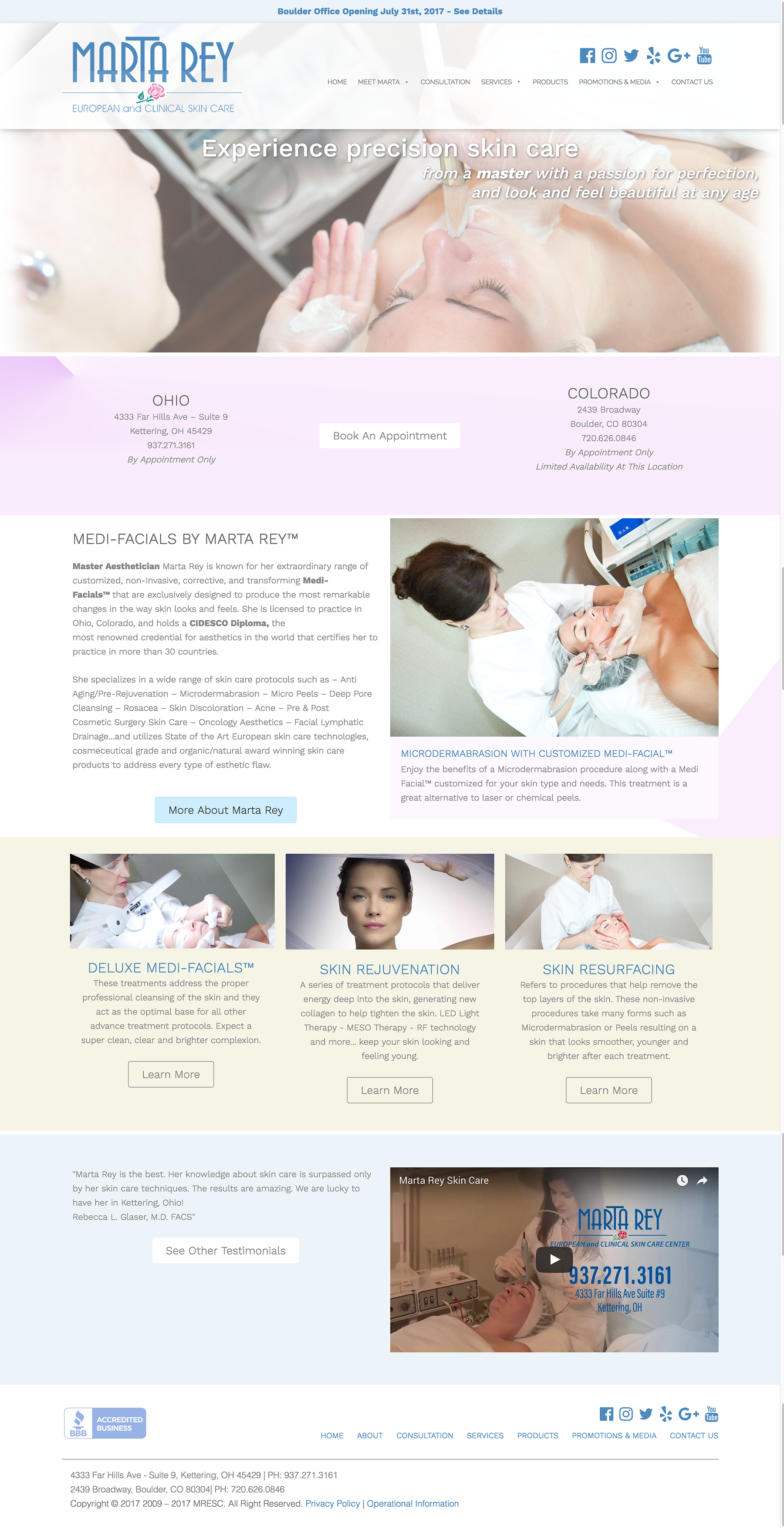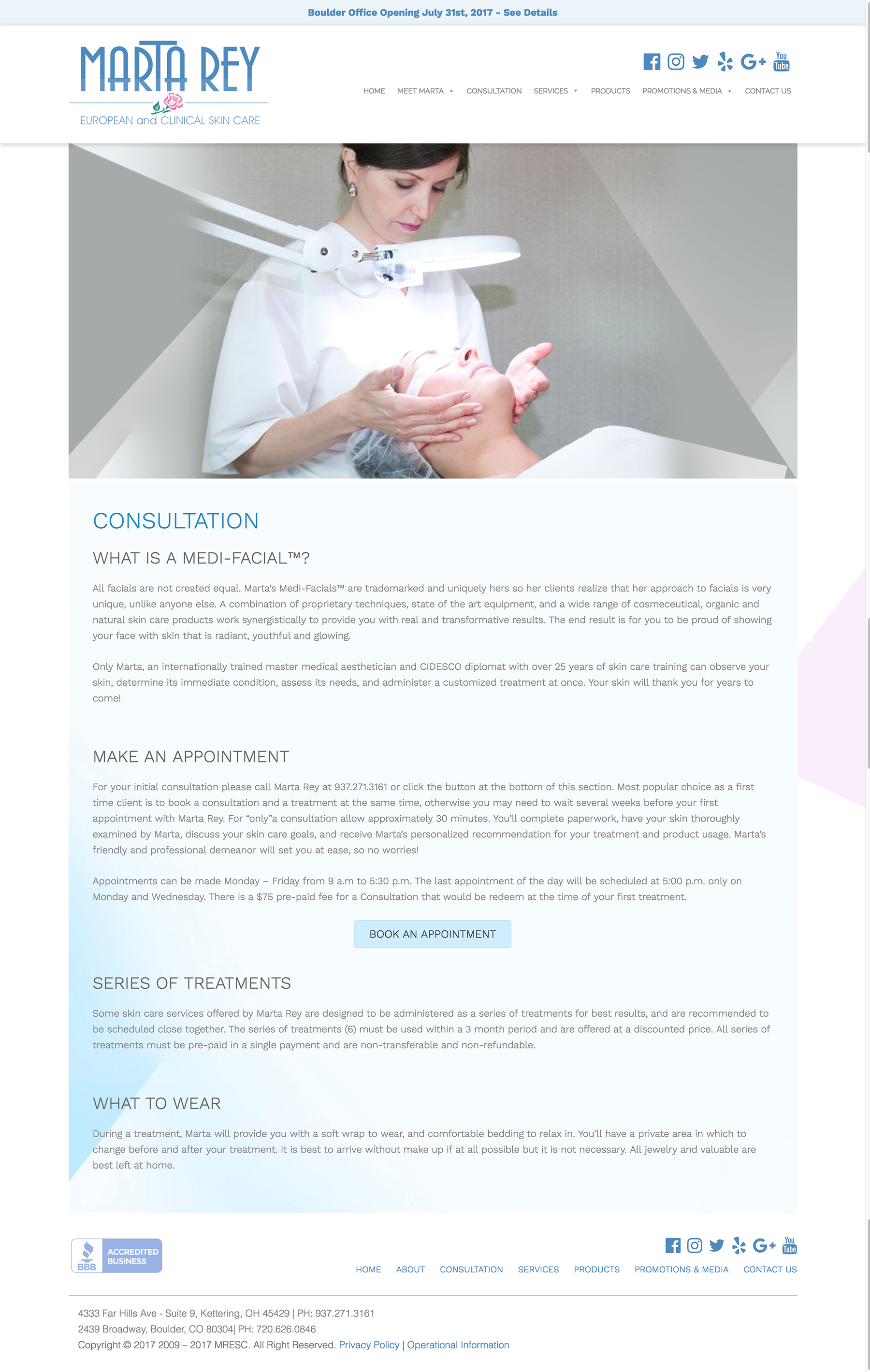
Marta Rey Skin Care
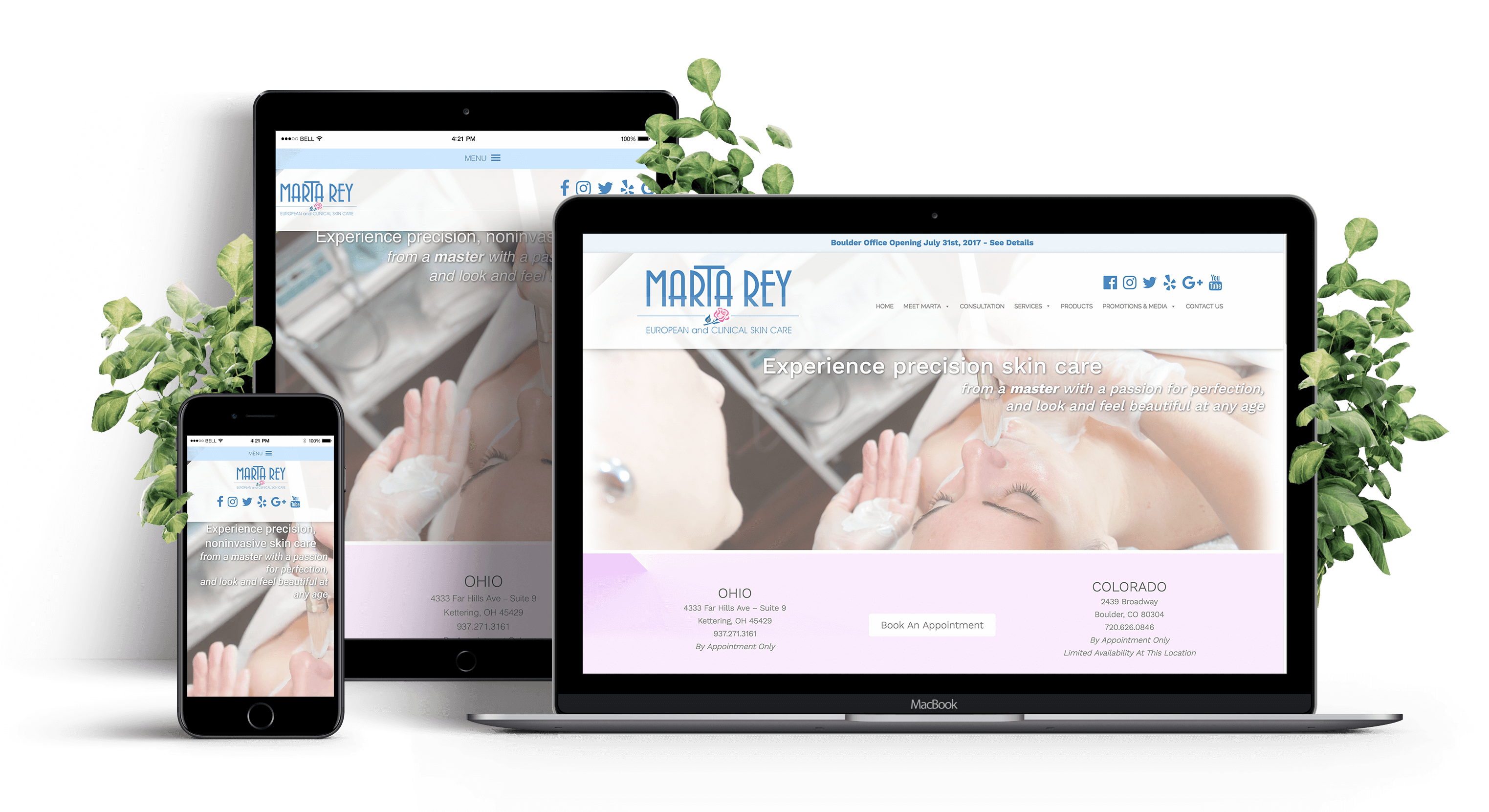
The Challenge
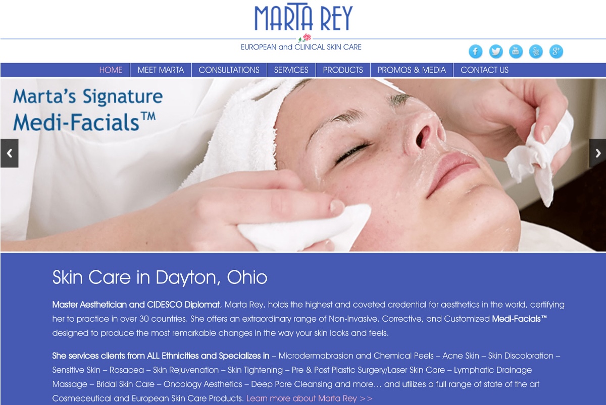
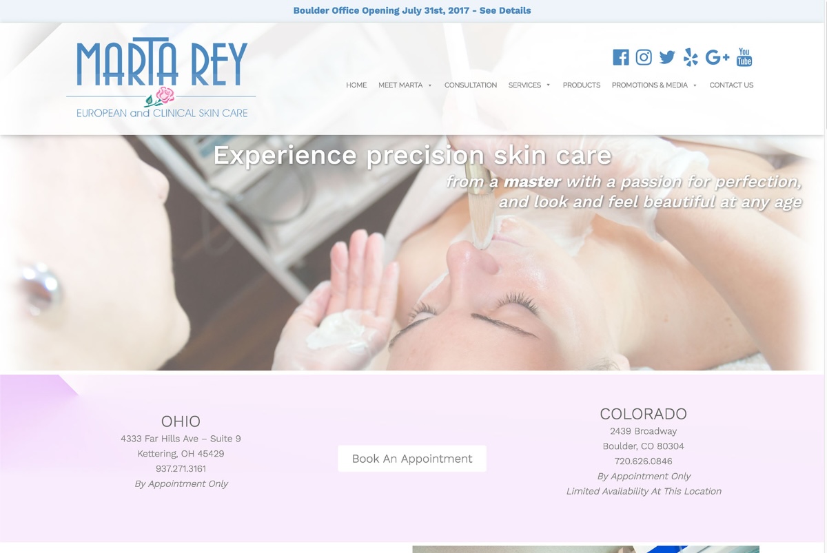
The existing site looked like an unmodified template — generic, and working against a skin care brand whose service is inherently about premium self-care.
The client wanted a redesign that felt sophisticated and, just as importantly, relaxing: skin care is a service people book to unwind, and a site that feels clinical or off-the-shelf undercuts that before a client ever sets foot in the door.
Strategic Approach
Three objectives shaped the redesign: make the site more user-friendly and professional, give it a sophisticated feel through a considered color palette, and organize content for a more exploratory browsing experience — fitting for visitors who are, in effect, being sold a feeling as much as a service.
A light, pastel palette chosen for mood, not just style
Colors were selected specifically to feel light and sophisticated rather than clinical or templated — reinforcing the sense of calm the client wanted associated with her services before a visitor even reads a word of copy.
Moving off the template look entirely
Custom layout and visual treatment replaced the generic, off-the-shelf feel of the original site, so the brand reads as considered and premium rather than assembled from a stock theme.
Content organized for exploration
Rather than funneling visitors through a rigid path, content was structured to invite browsing — matching the unhurried, relaxed experience the client wanted her service (and her site) to convey.
Design Rationale
Every decision worked toward the same outcome: make the digital experience feel as calm and premium as the in-person service itself, replacing a generic template with a sophisticated, mood-driven design built specifically around what skin care is meant to feel like.