SmartVideo
The Challenge
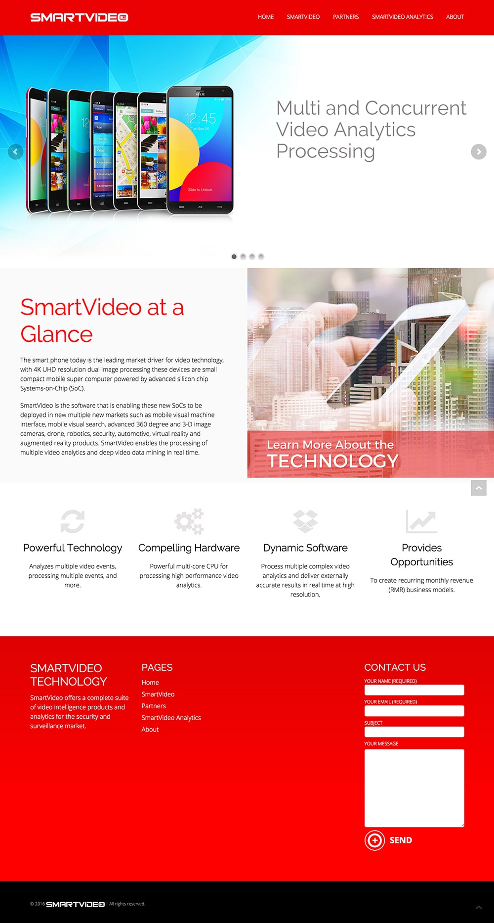
A brochure site with one job: be the business card for a video intelligence company selling into the security and surveillance market. The technology itself — face detection, license plate recognition, intrusion detection, and similar AI-driven applications — is complex and easy to describe poorly.
The site had to make it feel credible and current without a demo in the room, to an audience evaluating security and surveillance systems across mobile, automotive, drones, robotics, and smart cities.
Strategic Approach
When a website is the business card, every design decision either builds trust in the first few seconds or costs it. That meant two parallel tracks of work: a visual identity strong enough to signal legitimacy on its own, and a site structure clear enough to explain the technology without a demo in the room.
Color as strategy, not decoration
Bold red was chosen deliberately over a safer, more expected tech-brand palette (blues, grays). Red carries an “alert” association that’s a natural fit for a security product — it primes the sense of urgency and vigilance the technology itself is built around — while still reading as modern and confident rather than corporate.
Building the identity from the ground up
Logo variations and a style guide were developed so the brand had a consistent, professional visual language across every touchpoint — not just the homepage.
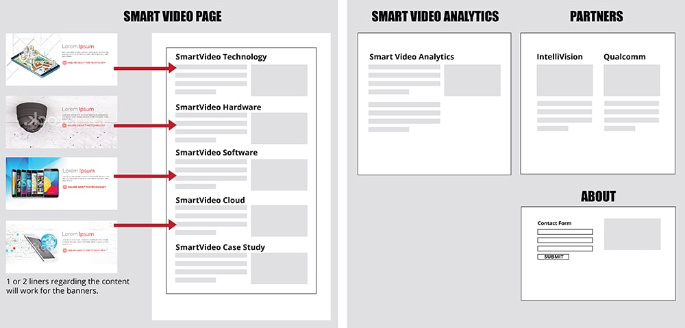
Wireframing before designing
Structuring the page flow first ensured the site could carry a technical product story clearly to a B2B security/surveillance audience, rather than defaulting to a template layout.
Designing for the full site, not just the homepage
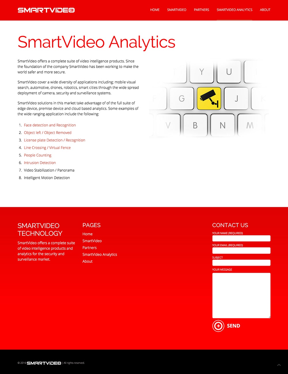
Inner pages — including a dedicated Analytics page breaking down each application (face detection, license plate recognition, line crossing, people counting, and more) — were built out with the same care as the homepage, so the “business card” impression holds up no matter where a visitor lands.
Responsive from the start
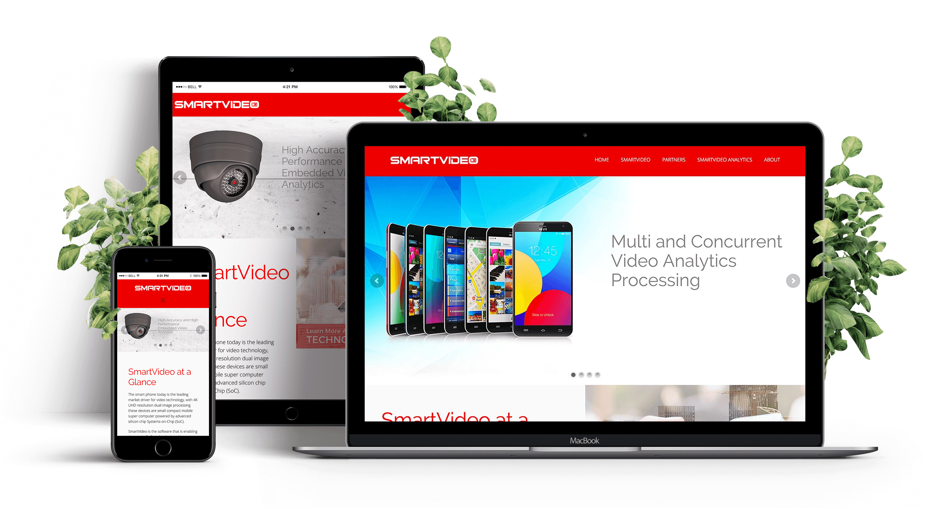
Mockups were built to hold up across devices, since a business card that only works on desktop isn’t doing its job.
Logo Design



Wireframes
Design Rationale
The result is a cohesive system — identity and site working together — where even the color palette does strategic work: reinforcing “security” and “act now” for an audience that needs to trust the technology before they’ll trust the sales conversation.